Retention locates a question in the video.
When the graph drops, watch that part of the video. What was the viewer waiting for? Did the explanation get confusing, or did the audience get the answer and leave? Write down the change you can see before deciding which explanation to investigate.
In YouTube’s audience-retention documentation, dips can reflect skipping or abandonment, while spikes can involve rewatching or sharing. A spike may also indicate that something was difficult to understand. The documentation also describes the first-thirty-second introduction measure and comparisons with similar-length videos. Those are useful report definitions, not universal creative targets.
A worked curve with three questions.
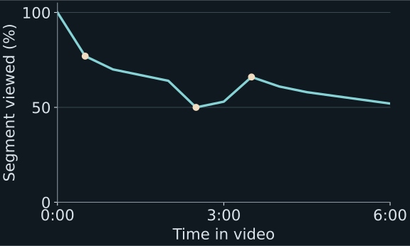
Entirely synthetic teaching data. This curve is not a YouTube export and does not report Machine House or client performance. The six-minute example makes three moments easy to inspect.
| Moment | Observation | What to inspect |
|---|---|---|
| 00:00–00:30 | The line goes from 100% to 77%. | Does the opening fulfil the title’s promise? Who arrived, and from which sources? |
| 02:00–02:30 | The value falls from 64% to 50%. | The teaching sequence repeats an earlier definition here. Is it repetition, a confusing transition or a change in the audience? |
| 03:00–03:30 | The value rises from 53% to 66%. | A comparison diagram appears. Did viewers return because it was useful, unclear or shared? |
The content descriptions are part of the invented example. They are candidate explanations to examine, not conclusions produced by the numbers. The downloadable dataset contains all thirteen points and explicitly separates this sparse curve from the aggregate video examples.
Compare the right viewing situations.
Before calling retention good or bad, record video duration, format, age at measurement and how the audience arrived. A search-led answer, a returning-audience interview and a broadly recommended film can create different viewing situations. Compare relevant segments where the platform makes them available and retain the definitions used in the report.
A percentage viewed and an average viewing duration answer different questions. In a six-minute example, 60% corresponds to 3:36; in a twenty-minute film it corresponds to twelve minutes. That arithmetic does not make the longer film automatically better. The intended job and the viewer’s experience still matter.
Use a suitable comparison cohort and enough observations to avoid turning a noisy early result into a rule. An average can conceal a strong opening followed by an unearned middle, or a weak introduction followed by a valuable explanation. Read the shape and the material together.
September 2026 measurement note: a public playback-start count does not establish how many people stayed. Keep the retention report and its stated basis with the curve. Do not reconstruct average viewing or subscriber conversion using a different public counter. YouTube’s API defines engaged views as viewing beyond the first frame or a click or tap to play; the name does not guarantee a substantial watch. Metric definitions · Why the distinction matters.
Write the observation separately from the explanation.
A review note that can lead to a test
Observation: in the synthetic example, retention is fourteen percentage points lower at 02:30 than at 02:00. The segment repeats a definition already established.
Hypothesis: the repeated explanation delays the next useful step.
Alternative: the transition is unclear, or this audience is seeking an answer elsewhere in the video.
Next test: in a comparable future piece, move directly from the definition into a worked application. Preserve the title’s promise and record the actual treatment.
This note says what to change and why, while leaving the conclusion open. “People have short attention spans” does neither. Do not cut every pause simply because the line slopes down. Some pauses let a difficult point land; some fast sequences lose the audience because the relationship between ideas is missing.
A popular moment may need explanation, not repetition.
For the spike at 03:30, inspect whether the diagram is readable, whether it introduces new terms and whether the narration gives the viewer time to understand it. Look for relevant audience questions without treating a few comments as a representative survey. If the graphic was unclear, copying it into every future video would repeat the problem.
If the moment works as a standalone insight, it may suggest another piece. Build that decision from the complete context and the audience’s next question. A retention spike alone does not determine that a clip will perform well on another platform or that the same packaging promise will remain accurate.
Turn the analysis into one editorial decision.
End the review with the observation, competing explanations, selected change, owner and evidence to check next time. Keep the original hypothesis and actual release treatment so the next review can assess whether the intended change happened.
Do not rewrite the explanation after seeing a result and pretend it was the original prediction. Equally, do not preserve a favourite theory when a later comparison contradicts it. The postmortem guide shows how to connect retention to equal-age performance and production context. Download the review worksheet.
Questions about the method.
Does a retention spike prove viewers loved that moment?
No. It can reflect rewatching, sharing or difficulty understanding the material. Inspect the actual sequence and relevant context before choosing an explanation.
What is a good YouTube retention percentage?
There is no single percentage that fits every duration, format and audience situation. Use relevant comparisons and inspect the actual moments, traffic context and intended job of the video.
Tell us what you want to make.
Tell us about the channel or idea, the team you have and where you need help. We’ll discuss the scope on a 30-minute call.
Book a 30-minute call rishwajeet@machinehouse.media